Some more information about the work behind the scenes that makes these Excel sheets easy to use but able to complete complex calculations. All identifying information has been removed and the sheets may have been simplified for display here.
Automatic Report Creation
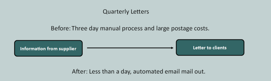
Before I was involved the process of sending the letters each quarter was completely manual. It was taking the clients more than three days to put the letters together. We worked together to streamline the process and have continued to refine things as we have gone along. Now, the data from the supplier is automatically converted into a format that is ready to mail merge to create the letters. The letters are produced and saved as PDF files. An excel spreadsheet then creates personalised emails to each client and attaches the PDF.
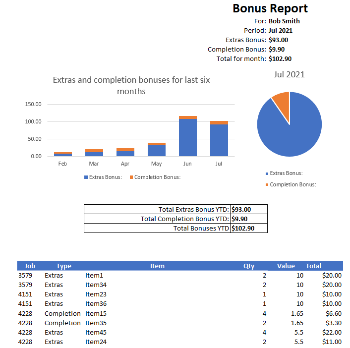
Automation of monthly report to employees
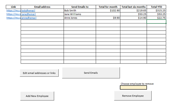
The control panel shown here displays the information for each employee and allows the user to make changes to email addresses and which employees get emails each month. The information on the amounts is automatically updated from the source each time the spreadsheet is opened and each month a report is generated to summarise the data for that month for each employee.
Drug Dose Calculator
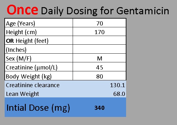
This sheet calculates a drug dose based on patient information. All the cells are locked and can’t be selected, except for the seven input cells. Each input cell has data validation on it to ensure input is sensible and if data is missing the user is prompted to complete the necessary cells. If the input values fall outside of a set range, then it defaults to “Contact the Pharmacy Department”. The rows and column indicators are hidden, so it doesn’t look like a spreadsheet. The final calculation uses interesting rounding. The value needed to be rounded to a multiple of 20 with 1 to 13 rounding down and 14 to 19 rounding up.
Dashboard
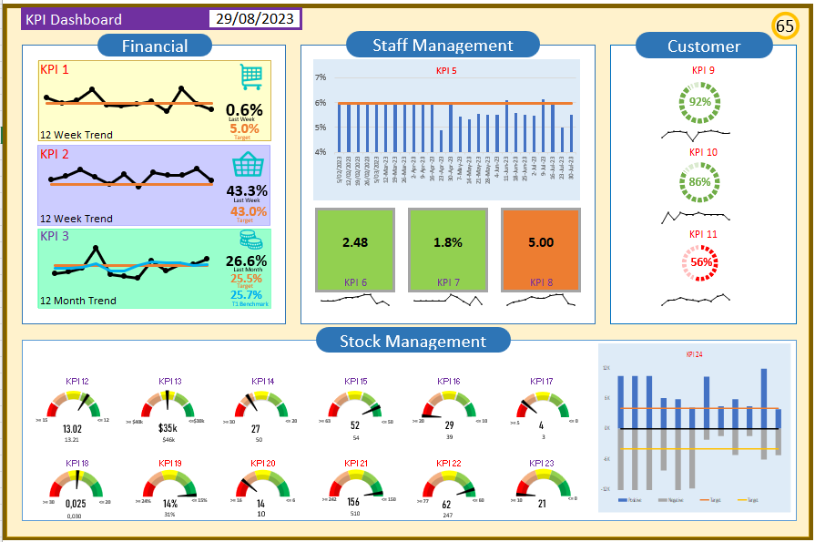
This is a KPI dashboard. It is dynamically coloured, so that as the values change so do the colours. For example, the background of the KPI 6 box will be green when the value is less than 3, orange if it is between 3 and 5, and red if it is greater than 5. Similarly, the dials on the right-hand side will change colour as their values change. The whole background will also change based on the overall score in the top right-hand corner.
Please contact me if you would like further information, examples, or trial versions.