Using a spilled range as a chart source will now automatically update the chart when the source changes. Another good reason to embrace these ‘new’ formula in Excel.
You can read more about one of these formulas here
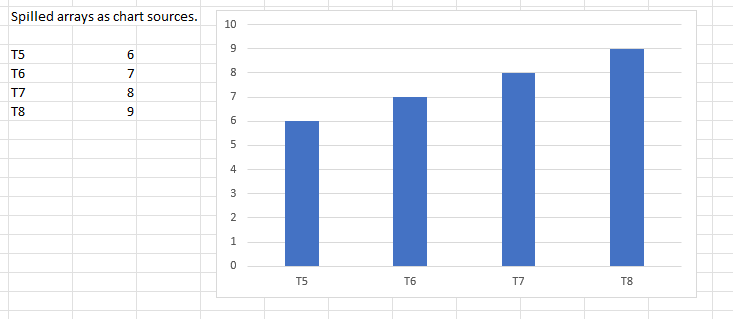
Below is a bar chart with the data source next to it. The data source is the result of a FILTER function.
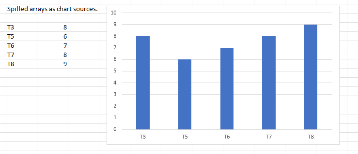
And below is the same chart with the same source, but the original data has changed, so the filtered data has changed and the chart has automatically updated. There was no need to change the chart, or the FILTER function. Once the original data changes, everything else happens automatically.
So, go ahead and use a spilled range as your source data, and don’t worry about having to update your chart if your source data changes.